![[bar graph of inauguration data]](../webtexts/bargraph.gif)
![[window settings 42-x-69]](../webtexts/barwin.gif)
![[stat plot 1 on L1 barchart]](../webtexts/barset.gif)
Data must somehow be entered into a computer before it can be analyzed. Optical scan sheets might be used or the data keyed in using a [micro]computer. Most statistical packages can import data, but comma separated, quote delineated, or fixed length fields are expected.
Various file editors can be utilized but the concept of a data record akin to a punch card is becoming an archaic concept. If one were to use a word processor, "hard returns" may be necessary and a fixed pitch font might help determine that the data is aligned into the proper columns. These programs generally allow the export of "flat ASCII" or ".txt" type files. (The alternative to ASCII (EBCDIC) is becoming a historic footnote as well.)
Spreadsheet programs have become a common way to enter data. As stated in the syllabus, however, they do not replace statistical packages for analyzing data. Generally there are no statisticians employed in the creation of spreadsheet programs, there is no warranty, implied nor expressed, regarding the validity of its statistical output, so time is probably better spent otherwise!
| 4 | | | 23667899 |
| 5 | | | 0111112244444555566677778 |
| 6 | | | 0111244589 |
Please note that the separation line should be continuous, but time constraints limited accomplishing that feat. The following rules should be observed when constructing stem-and-leaf diagrams.
| 4 | | | 23 |
| 4 | | | 667899 |
| 5 | | | 0111112244444 |
| 5 | | | 555566677778 |
| 6 | | | 0111244 |
| 6 | | | 589 |
|
A frequency table lists in one column the data categories
or classes and in another column the corresponding frequencies. |
| Profession | Salary (in $) | frequency |
|---|---|---|
| Teacher | 36,000 | 1,000,000 |
| notebook assembler | 360,000 | 100,000 |
| Netscape® programmer | 3,600,000 | 100 |
| Windows® programmer | 36,000,000 | 10 |
| Bill Gates | 360,000,000 | 1 |
Some authors abbreviate frequency with the letter f. Frequency refers to the number of times each category occurs in the original data. Often, the category column will have continuous data and hence be presented via a range of values. In such a case, terms used to identify the score (class) limits, exact limits (class boundaries), class intervals (class widths), and interval midpoints (class marks) must be well understood. For the following examples, we will use the split stem presidential inauguration data from the stem-and-leaf diagram above.
| Score limits (class limits) are the largest or smallest numbers which can actually belong to each class. |
For this example, the score limits are 40 and 44 for the smallest class and 65 and 69 for the largest class. Each class has a lower score limit and an upper score limit.
|
Exact limits (class boundaries) are the numbers which separate classes. They are equally spaced halfway between neighboring score limits. |
For the presidential inauguration data the exact limits would be 39.5, 44.5, 49.5, 54.5, 59.5, 64.5, and 69.5. Note that 39.49999... is another name for and identical with 39.50000..., but emphasizes it as a left-handed instead of a right-handed limit.
| Interval midpoints (class marks) are the midpoints of the classes. |
For this example, the interval midpoints are 42.0, 47.0, 52.0, .... It may be necessary to utilize interval midpoints to find the mean and standard deviation, etc. of data summarized in a frequency table. This is because information often has been lost and we make two important assumptions: 1) the scores are uniformly distributed between the exact limits of the interval; 2) Whenever a single score is used to represent a class interval, the interval's midpoint will be utilized.
| Class interval (class width) is the difference between two exact limits (class boundaries) (or corresponding score/class limits). |
For this example, the class width is 5.0. Following are guidelines for constructing frequency tables.
If your limits are not immediately obvious based on the data, try to find an appropriate width by rounding up the range divided by the number of classes. Your lower limit should be either the lowest score, or a convenient value slightly less. Avoid irrelavent decimal places. Large data sets justify having more classes. One published guide is: number of classes = 1 + log2n. This gives you 5 classes for small data sets of 12 to 22 elements and 10 classes for larger data sets of 362 to 724 elements. The seven classes used above for 50 elements is right on target. It is not uncommon to omit empty classes—be alert for such guideline violations! Omitted classes do not change the class width, but can be a real source of confusion!
| Relative freqency tables contain the relative frequency instead of absolute frequency. |
Relative frequencies can be expressed either as percentages or their decimal fraction equivalents.
| Cumulative frequency tables contain frequencies which are cumulative for subsequent classes. |
In a cumulative frequency table, the words less than usually also appear in the left column.
The x-axis often represents ordinal data. The equal differences between values can tend to imply interval data when such is not the case. Use care when evaluating such a graph. If you look at a graph of the Dow-Jones Industrial Average you will quickly note that the y-axis has been exaggerated and the small range of values of recent interest are magnified. Proper protocol requires the y-axis to be broken with a pair of short parallel oblique lines before it mets the x-axis.
Ordered pairs of (x,y) data points can be plotted either in isolation or by connecting the points. When the points are connected the term data curve is used. The curve, however, may well be composed of straight-line segments and so does not correspond with the popular usage of this word.
Since the scales of measurement along the axes can be quite arbitrary, graphs can easily be used to support even opposite points of view. A new rule to me that helps avoid distortion and provide consistency is to use an aspect ratio of 4:3 for the horizontal:vertical axes' lengths. This has been called by some the three-quarter-high rule. Examples of graphs, including bar graphs and scatterplots, will be discussed below.
|
|
|
|
| A relative frequency histogram has the same shape and horizontal scale as a histogram, but the vertical scale is now the relative frequency. |
| A Pareto chart is a bar graph for qualitative data. |
The bars in a pareto chart should be arranged in descending order of frequency, from left to right.
| Frequency polygons are similar to histograms, but use line segments to connect the points. |
When construction a frequency polygon, the class marks should be used on the horizontal scale. The graph should also be extended to the left and right so that it begins and ends with a frequency of 0.
| Cumulative frequency polygons, also known as ogives, are also commonly encountered. |
A pictograph depicts data by using pictures of an object, such as coins, money bags, airplanes, etc. Those which use multiple objects the same size are ok. Those which use similar objects, scaled linearly to represent data, can easily distort things. There may be many other variations, but those listed above are most common.
Distributions which may have some arbitrary large values, such as home valuations, but many small values, are termed positively skewed. Distributions which may have the opposite characteristic, such as the Harvard grade distributions, where most are high and only a few are low, are termed negatively skewed.
A distribution may be uniform (such as the probability of getting any particular pip count when rolling one die) or symmetric (such as the probability of getting any particular pip sum when rolling a pair of dice). In fact, the uniform distribution given above is also symmetric. In a symmetric distribution there is a line of symmetry such that if the graph were folded the two sides would coincide.
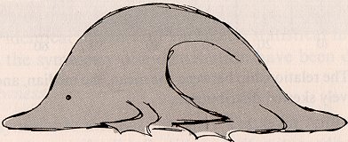
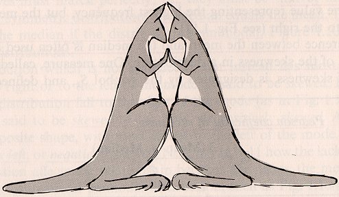
The most common distribution shape is heap-shaped
or mound-shaped, looking like someone just
took a basket of something and dumped it out.
If the mound spreads out a lot (like water!)
the degree of peakedness or kurtosis is low
and the distribution is said to be platykurtic.
A uniform distribution is platykurtic.
If the mound piles up like a stalagmite,
the distribution is said to be leptokurtic.
The reference standard is the normal distribution
and how peaked a distribution is about the mean in comparison.
The images below are from Gosset via Harnett (1975).
The shape of a distribution is extremely important
and will be considered extensively throughout the
rest of this course.
|
| ||||
| Short-tailed platykurtic. | Long-tailed leptokurtic. |
| BACK | HOMEWORK | NO ACTIVITY | CONTINUE |
|---|